Customizing 2-Axis and Mixed Charts
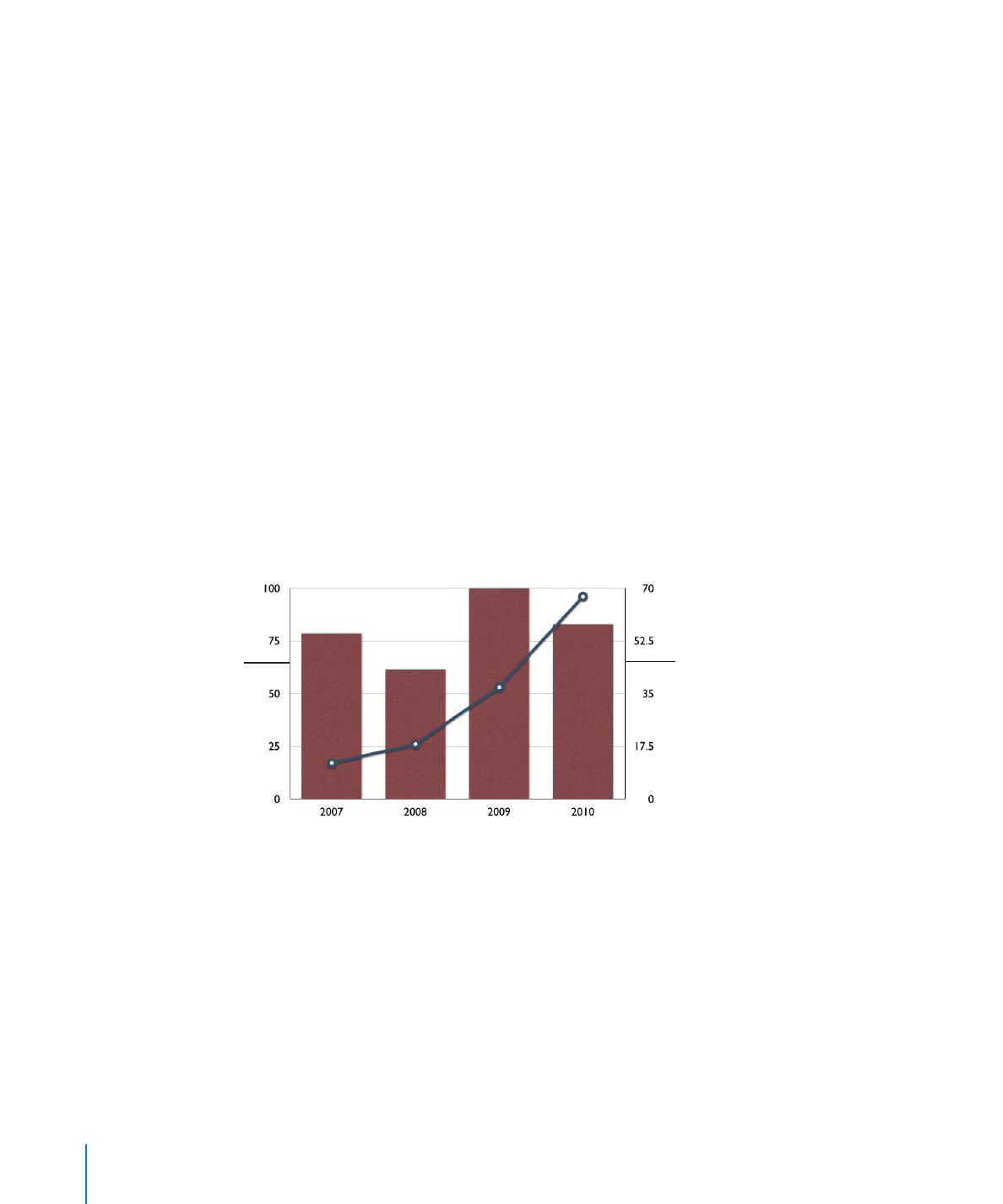
Charts with two axes feature a line chart superimposed upon a column or area chart
and show a different value axis (y axis) for each chart. The axis on the left side of the
chart belongs to the first data series listed in the Chart Data Editor, represented by a
line and is called Value Axis (Y1). The axis on the right side of the chart belongs to the
second data series listed in the Chart Data Editor, represented by columns and is called
Value Axis (Y2). The Chart inspector provides controls that allow you to format each of
the axes individually.
Mixed-type charts present a single chart in which each of the two series can be
represented as a different chart type. For example, one data series can be represented
by a line while the other data series is represented by columns.
For both 2-axis and mixed charts, only a single data series can be represented by each
chart type. Either data series can be represented as a column, line, or area chart.
This is the y axis
for the data series
represented by a line.
This is the y axis for the
data series represented
by columns.
To change a chart type in the figure:
1
Select the data series for which you want to change the chart type.
2
Click Inspector in the toolbar, click the Chart button, and then click Series.
3
Select a chart type from the Series Type pop-up menu.
To learn about other formatting options, see “Formatting Charts” on page 228.
244
Chapter 10
Creating Charts from Data

Chapter 10
Creating Charts from Data
245